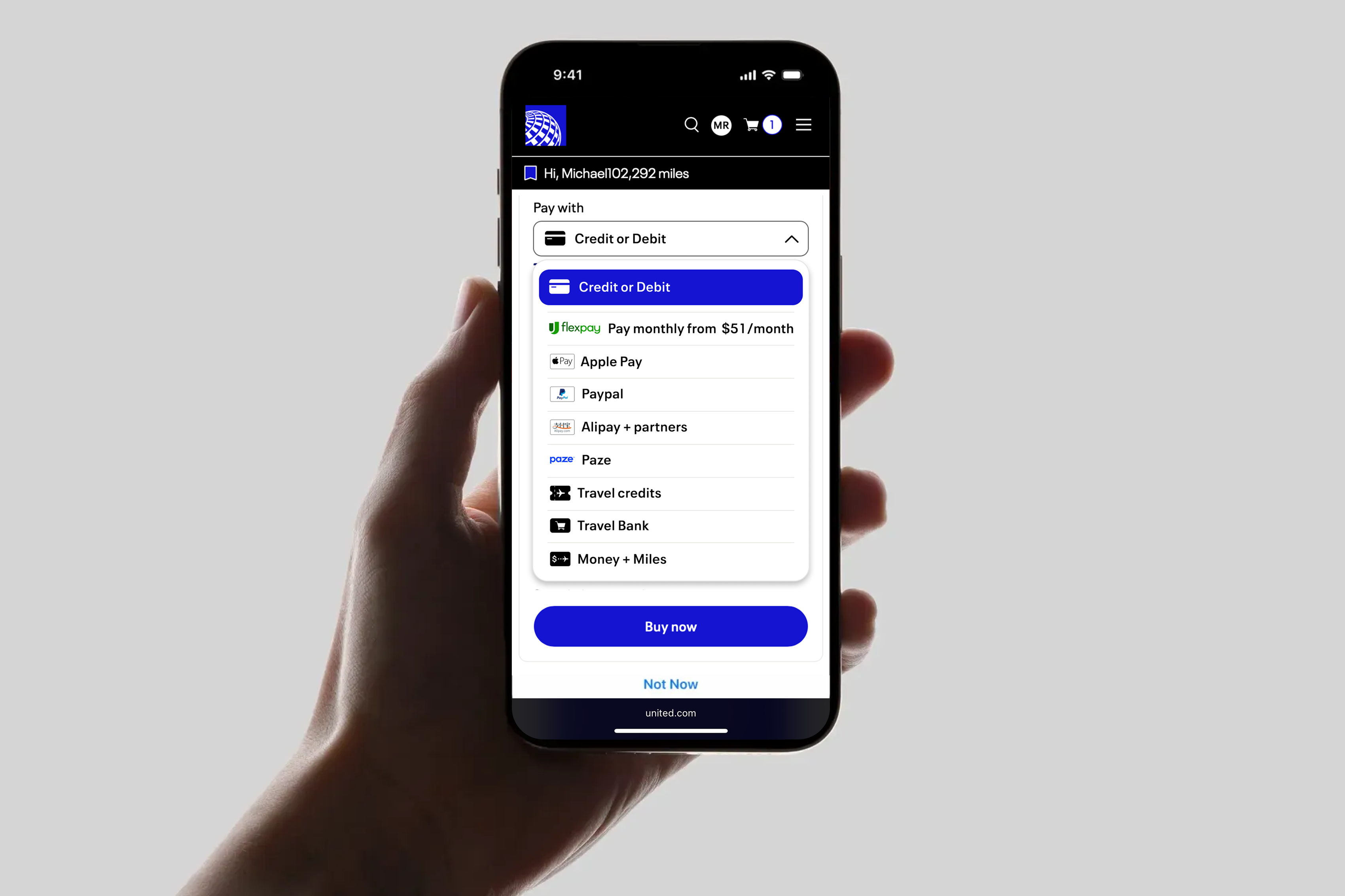
Checkout page
redesign
Case #1


Project details
Role
Lead designer
Design goal
Improve checkout experience & reduce decision fatigue
Context
Page is responsible for 55% of all revenues ($28b)
Business impact
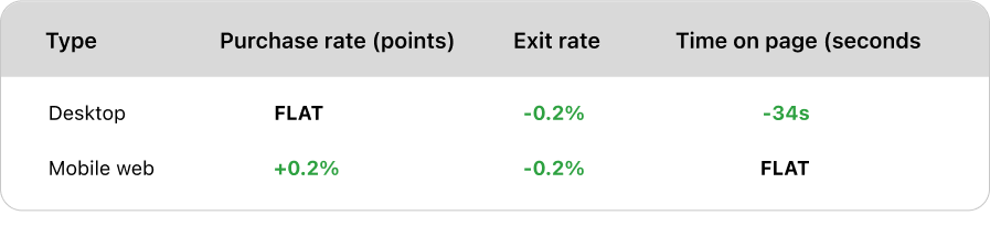
Slash the checkout time by 22 seconds in some cases

Problem
Customers are shown 10+ payment options on the checkout page and are showing signs
of decision fatigue. We are adding a new form of payment every 1-2 months.
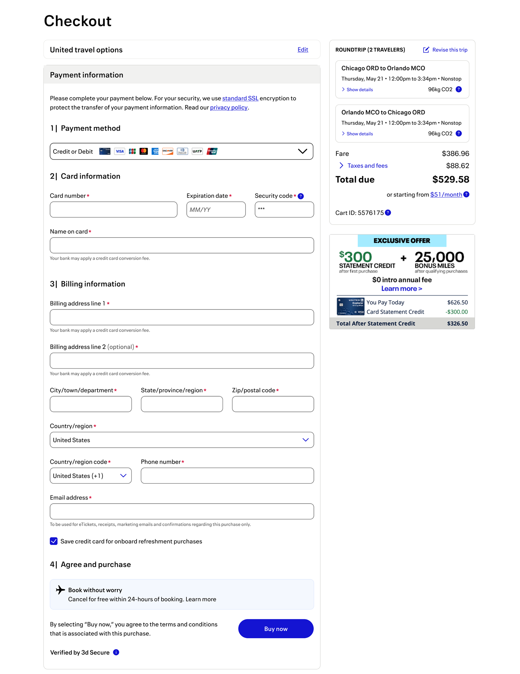
Current state
Today’s checkout page surfaces 8 forms of payment, with a total
of +20
possible combinations.
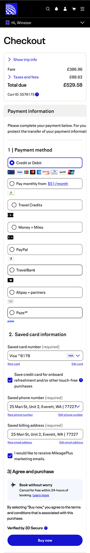
Today’s checkout page seems to be unfocused and navigation
does not
always seem clear to customers.
The median user goes through 7 steps before completing their purchase. On
average users will go through 13 steps.
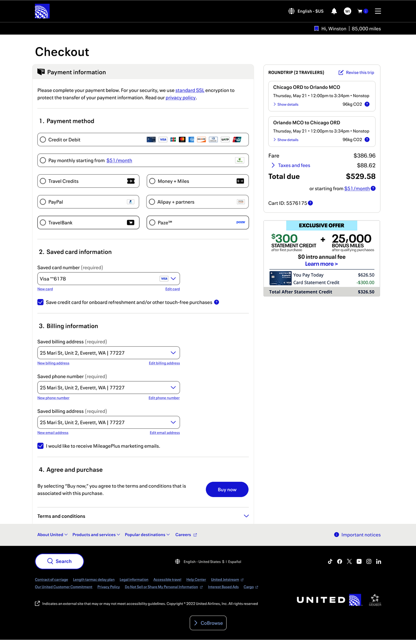
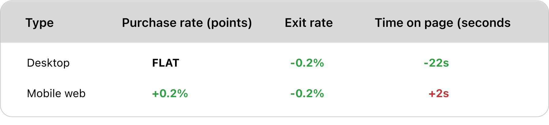
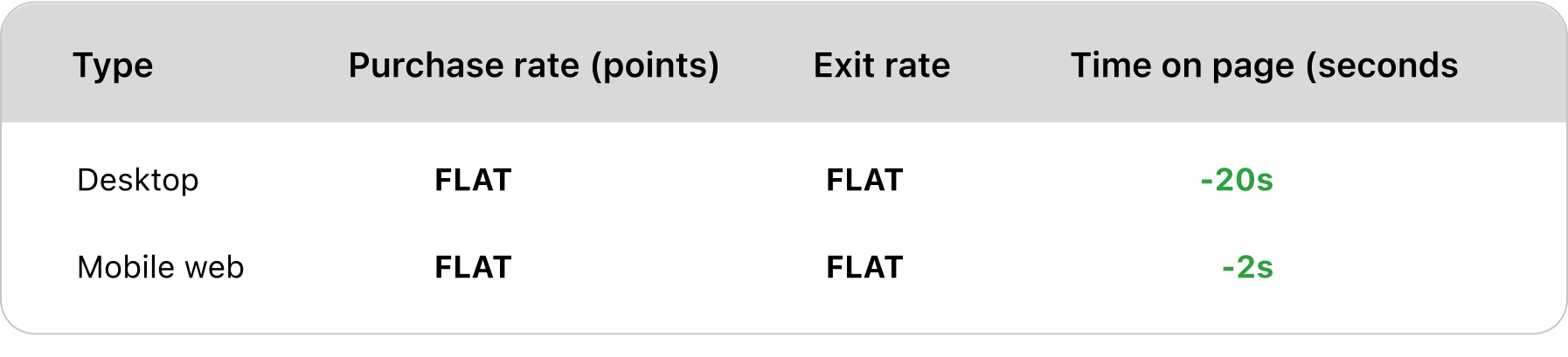
Variants tested
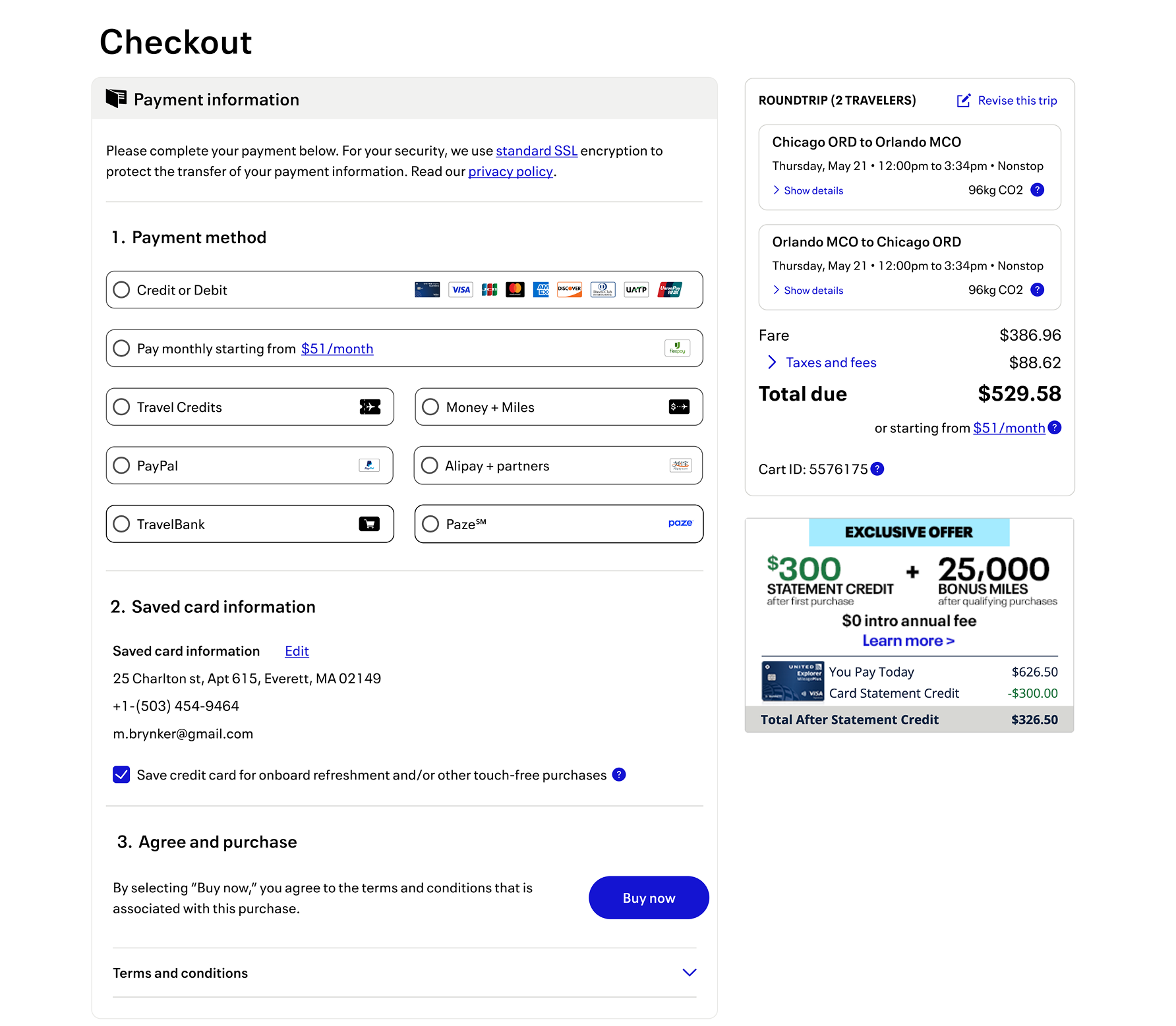
Condensed payment options. A single drop down containing all forms of
payment.
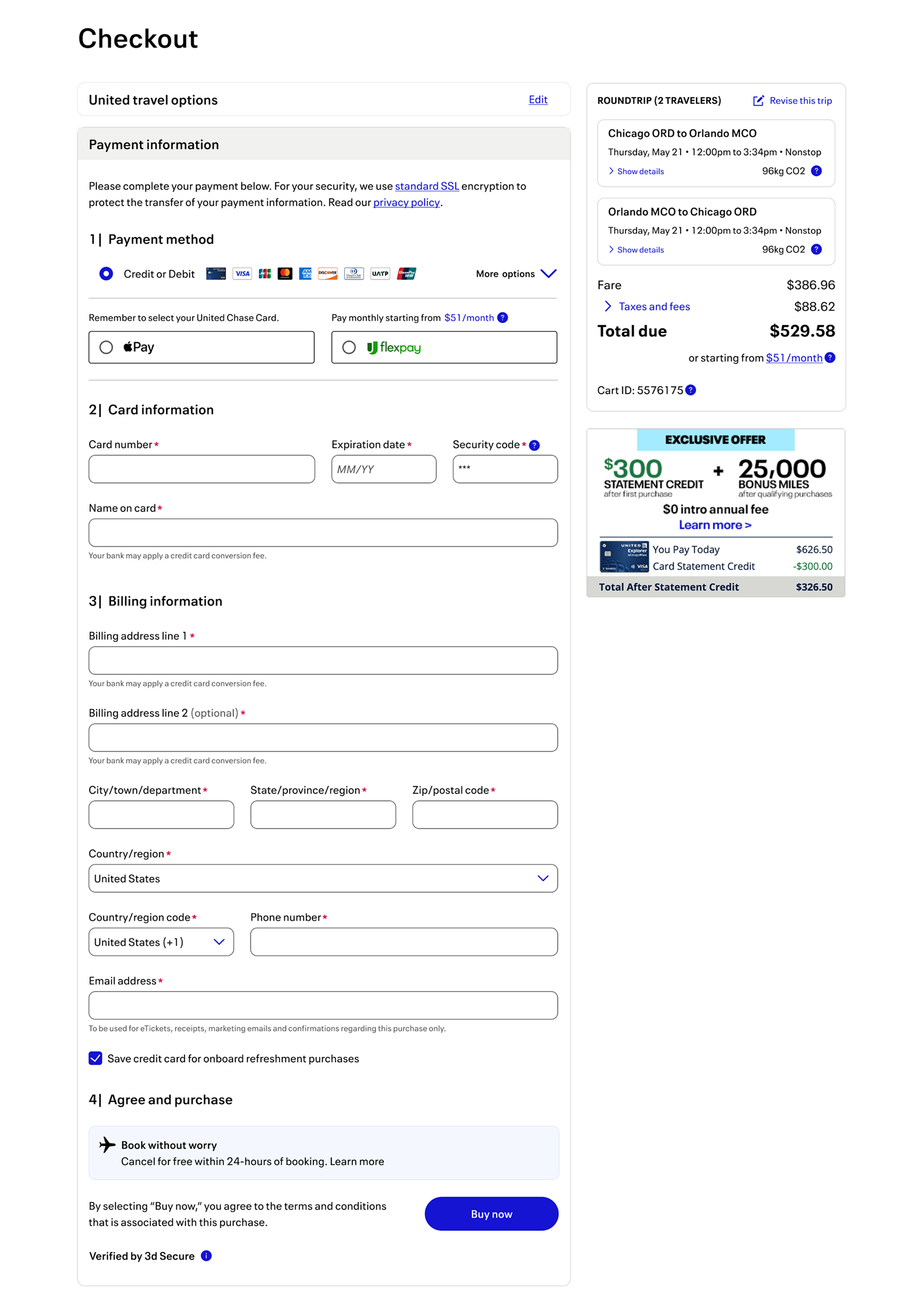
Condensed payment options, except for the two most popular ways of payment
(credit card and pay-over-time options like, Flexpay).
Save the last known billing address for forms of payent in plain text.
Hide the billing field drop downs.
Combination of variant 2 & 3 (condensed payment options + 2 most popular
payment options and condensed billing).
Combination of variant 1 & 3 (condensed payment options and condensed billing).
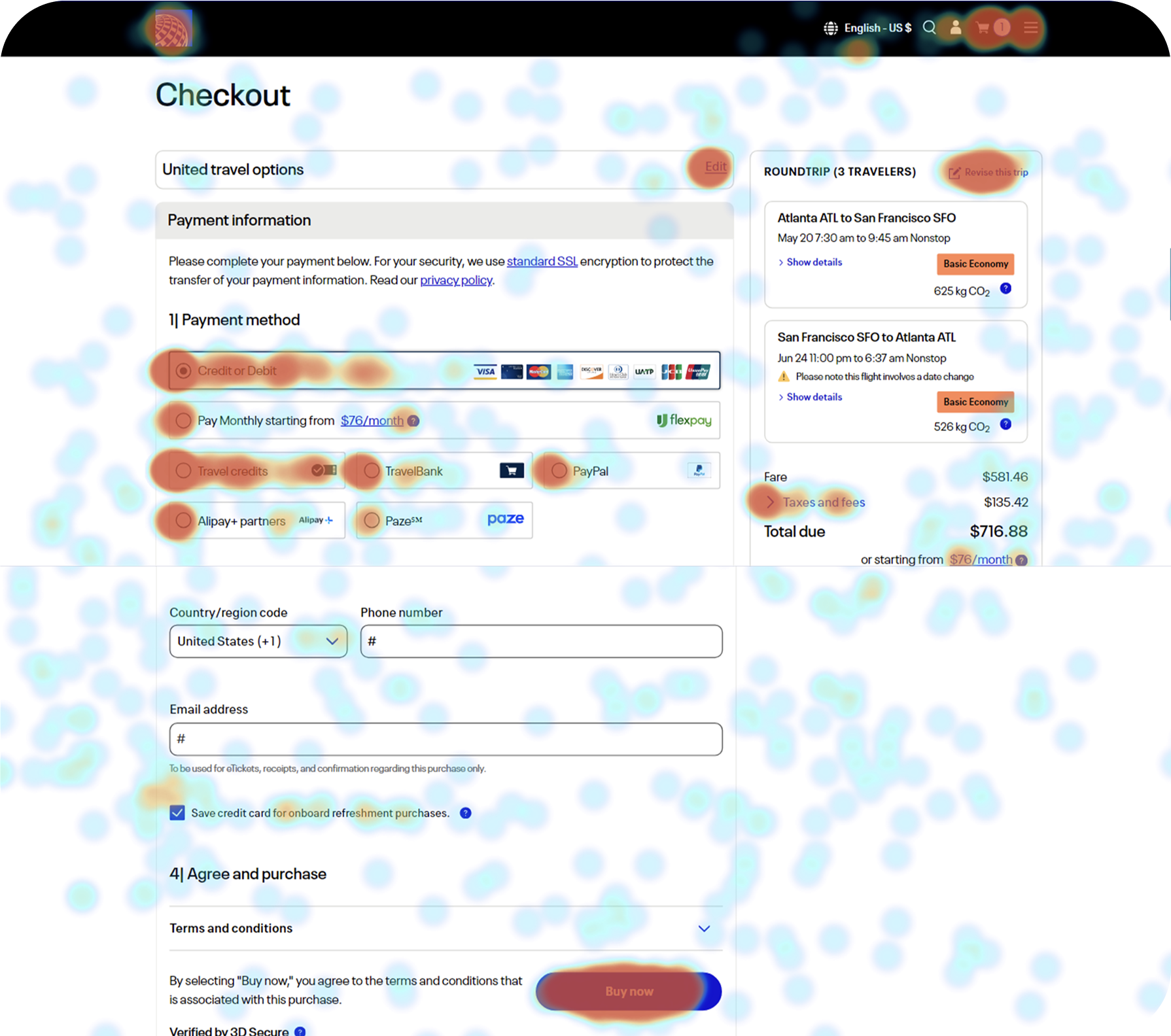
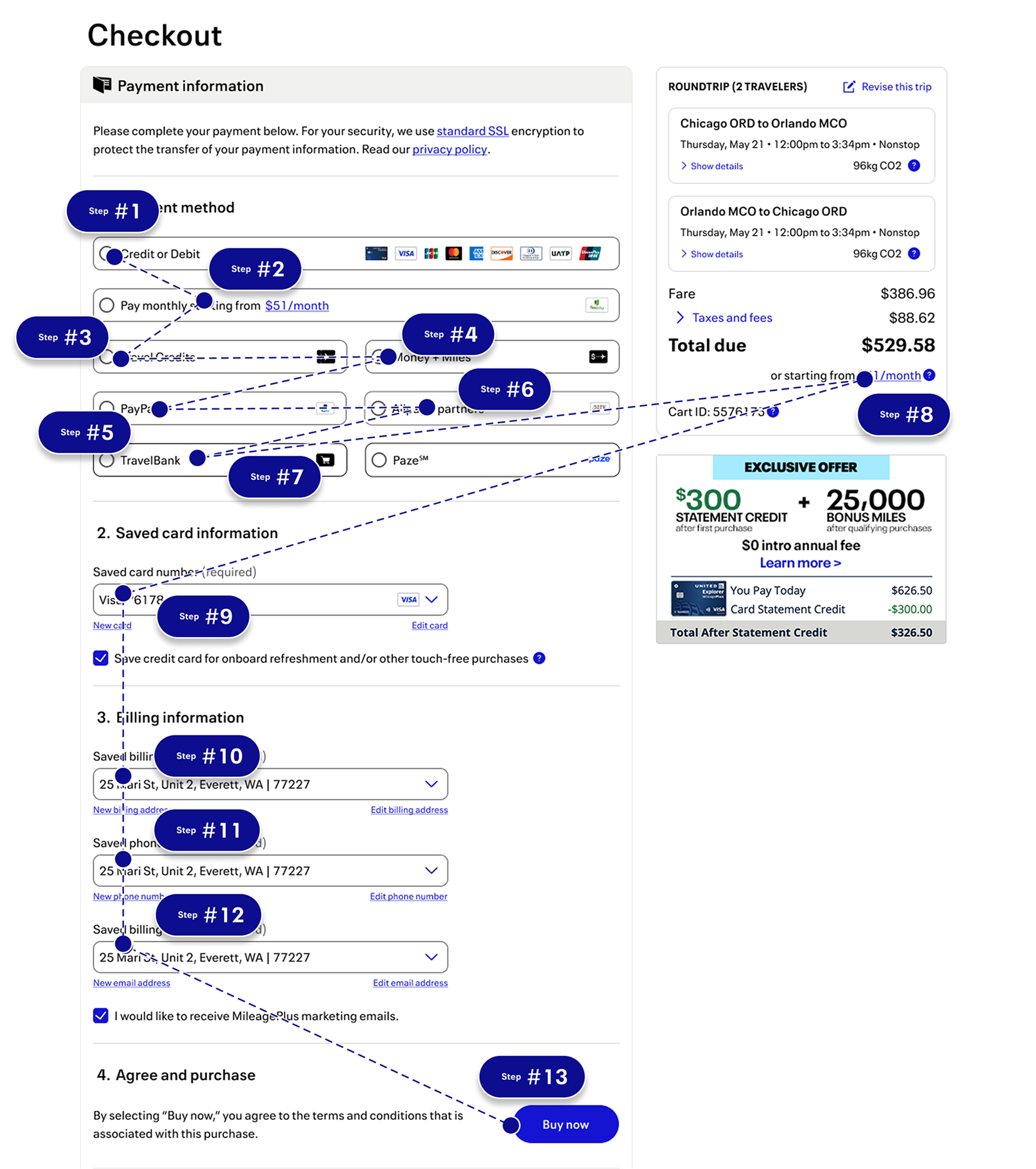
Results
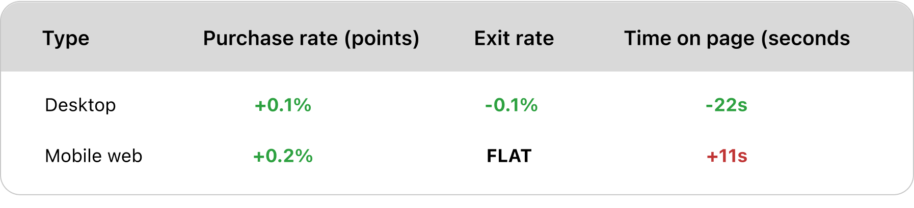
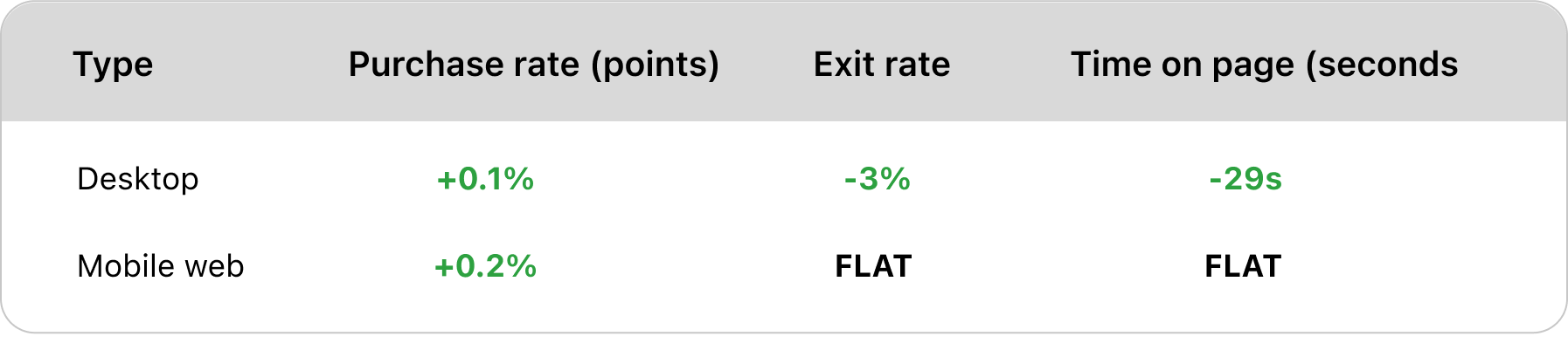

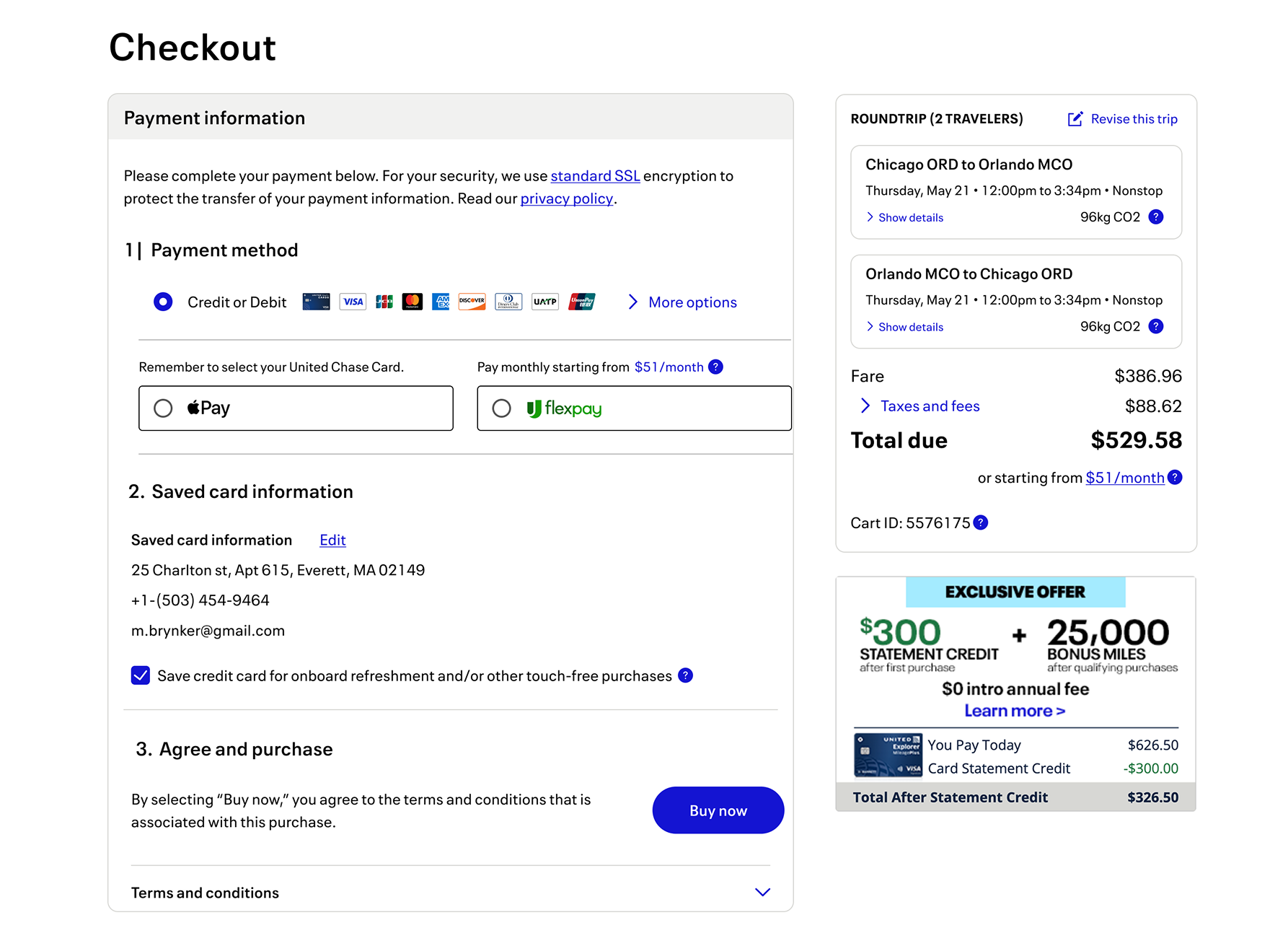
Solution
Customers are able to navigate to to their prefered payment method the fastest and
finzalize on their payment with the highest frequently, when there is only one payment
field.
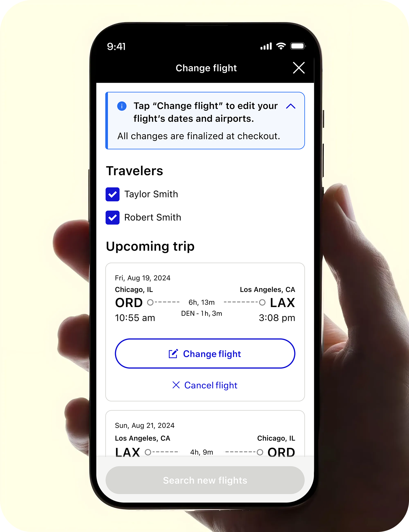
Change flights
Case #2
Project details
Role
Lead designer
Design goal
Reduce friction for customers changing their flights
Context
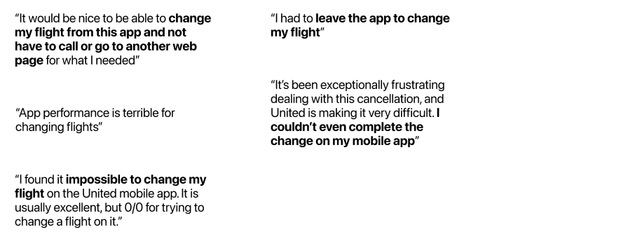
Customer’s calling in to change flights is burdensome
Business impact
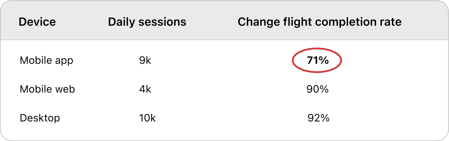
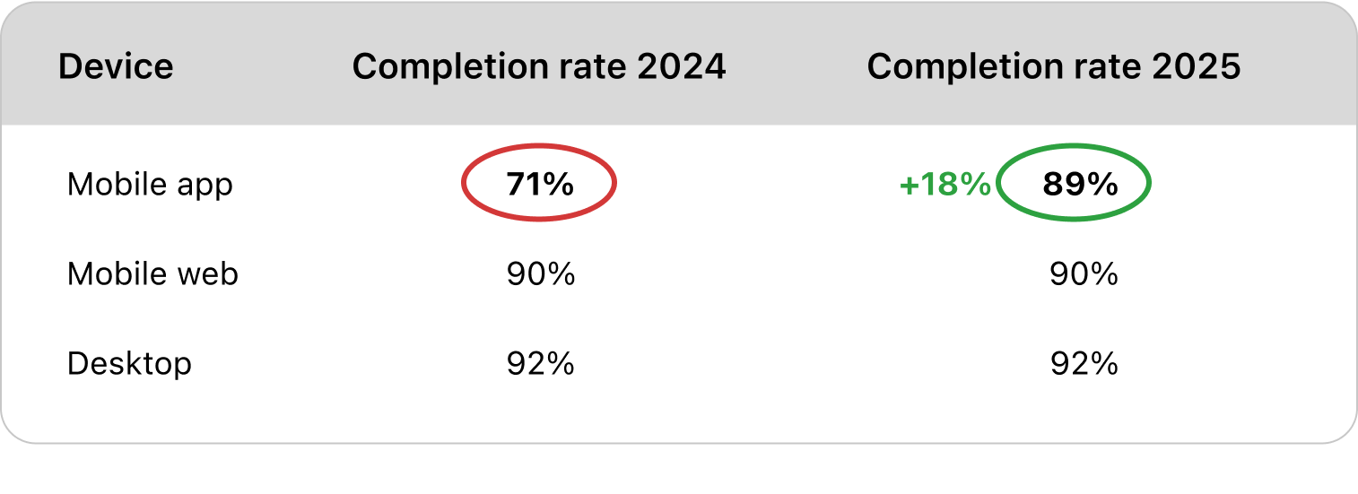
Increase completion rate by +18%
Problem
Customers are finding it diffulcult to navigate the Change flights flow and are not confident doing so.
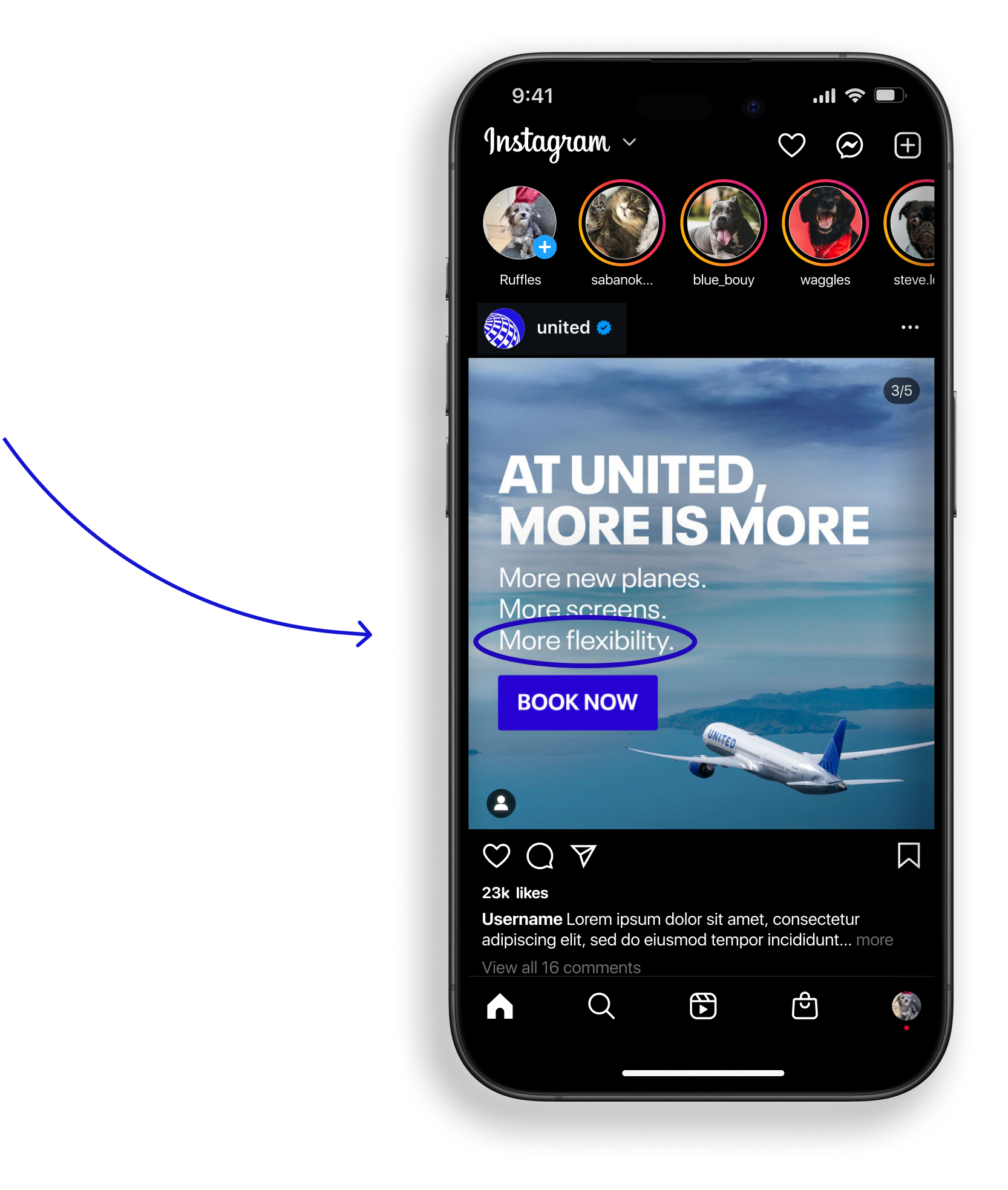
In 2024 United Airlines invested $225 million into technology and digital innovations, one focus area was making flights more “flexible”. The “More flexibility” strategy is a key differentiator for United Airlines brand.
Original design
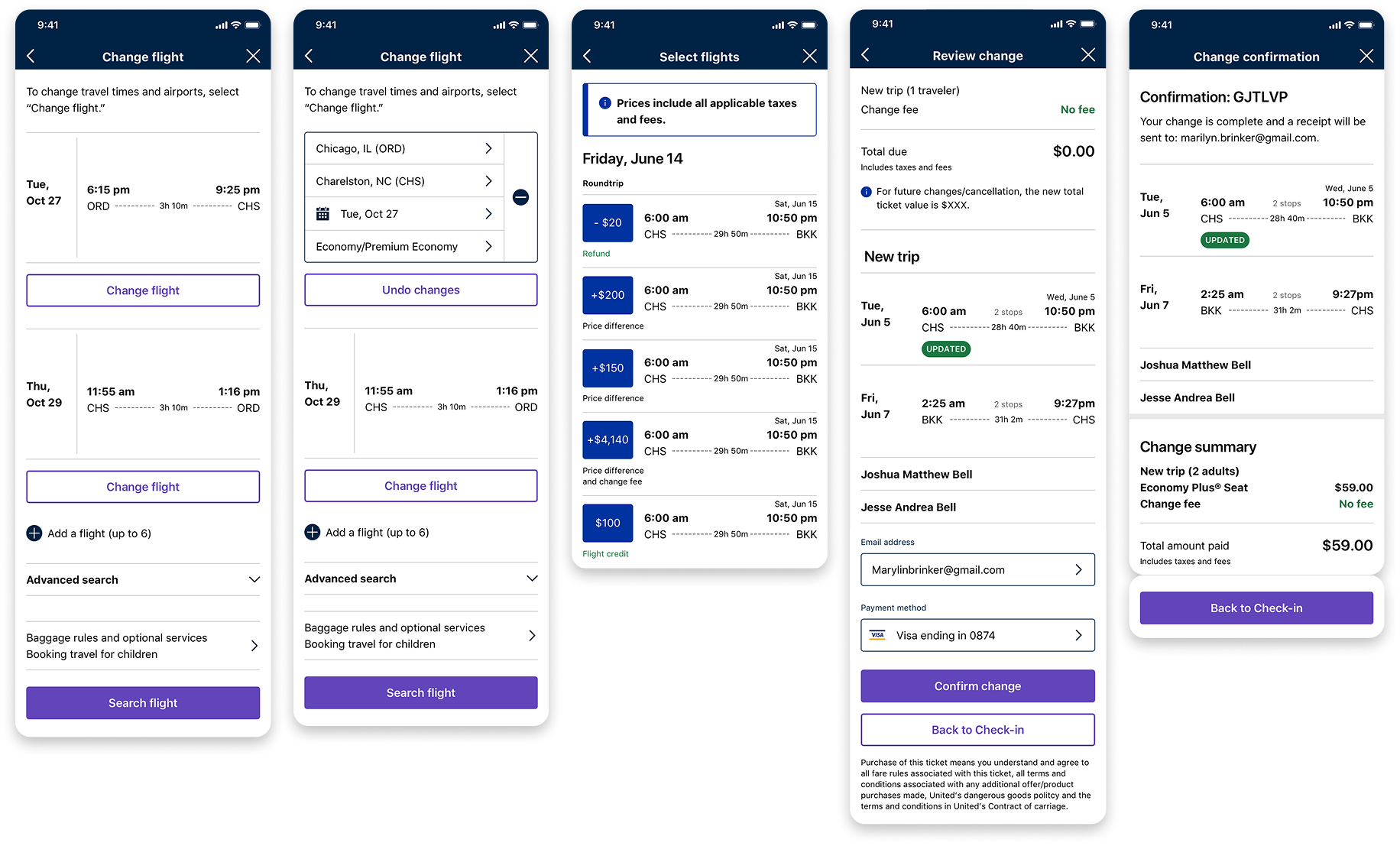
Prototype 1
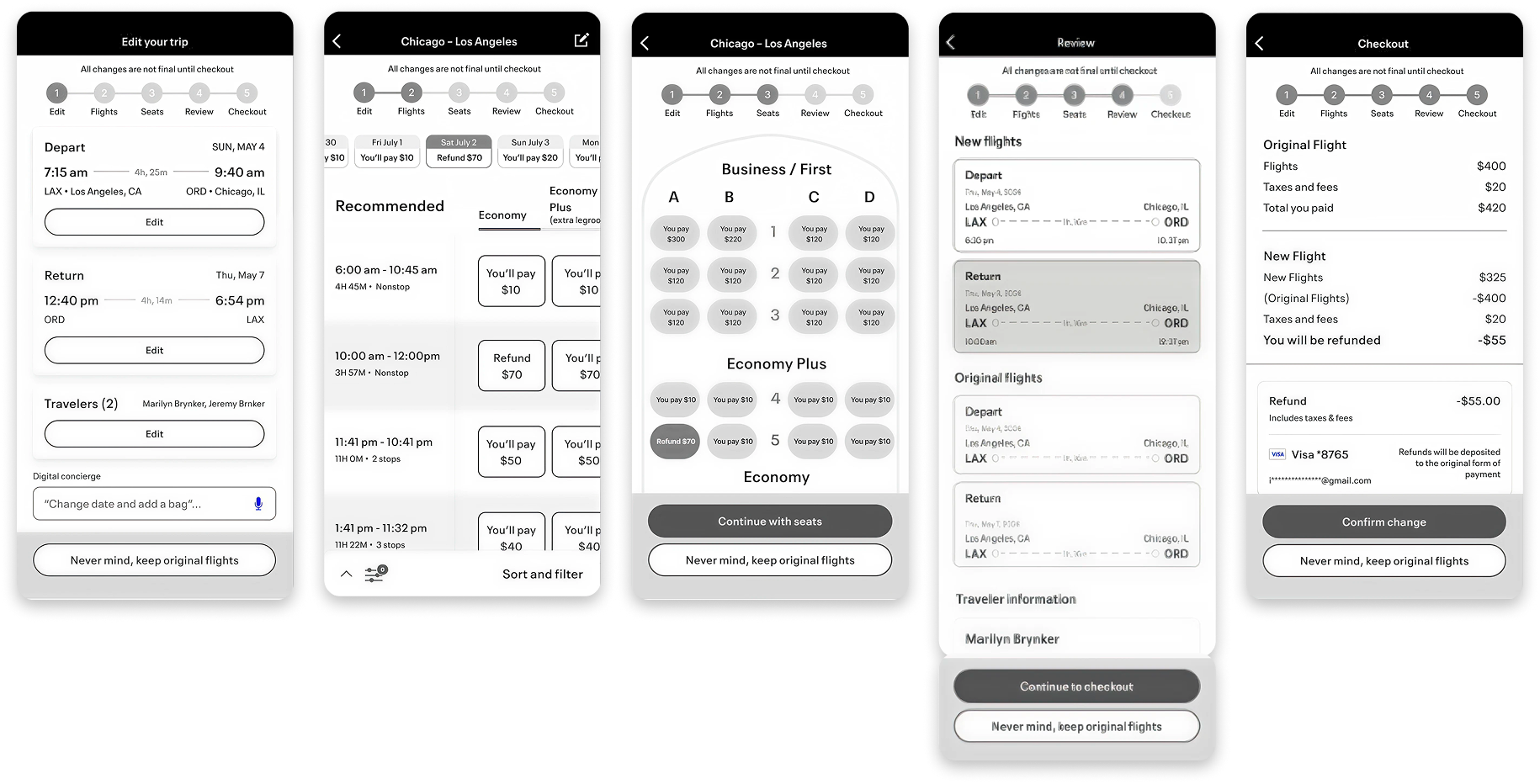
Prototype 2
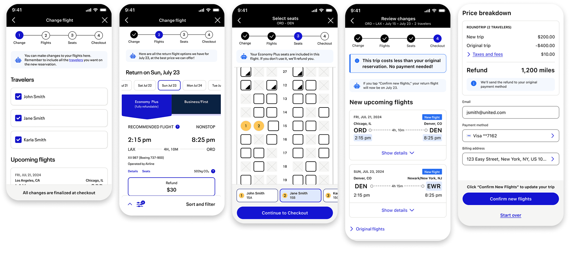
Final design
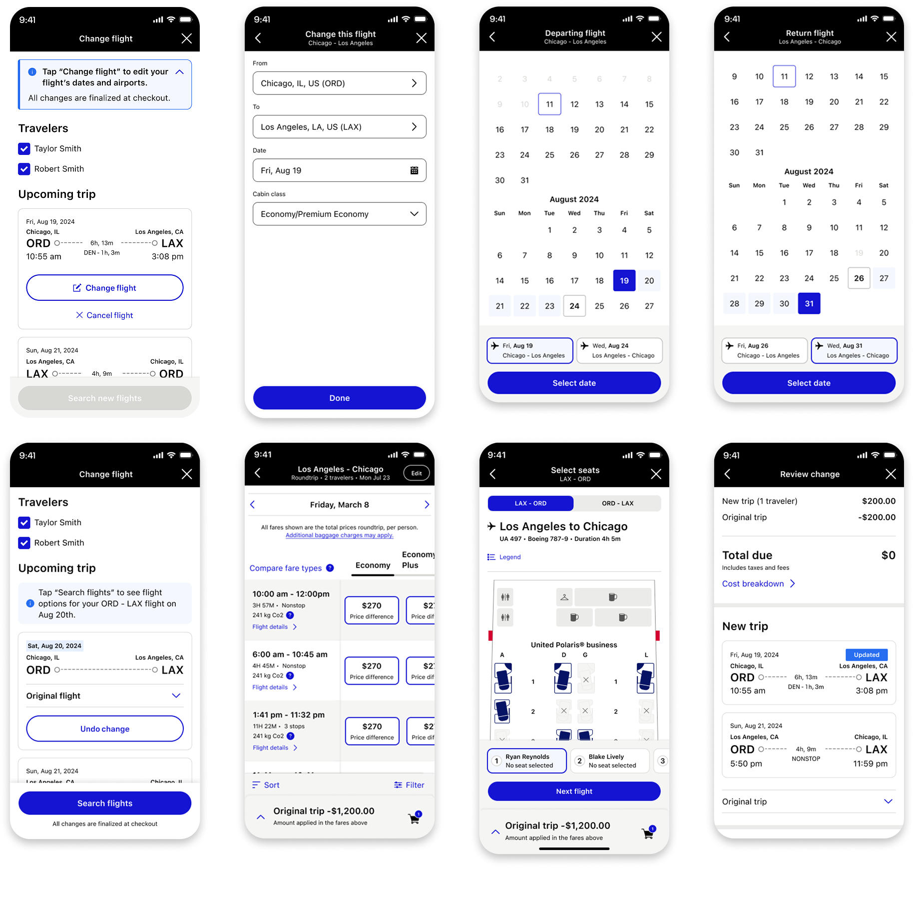
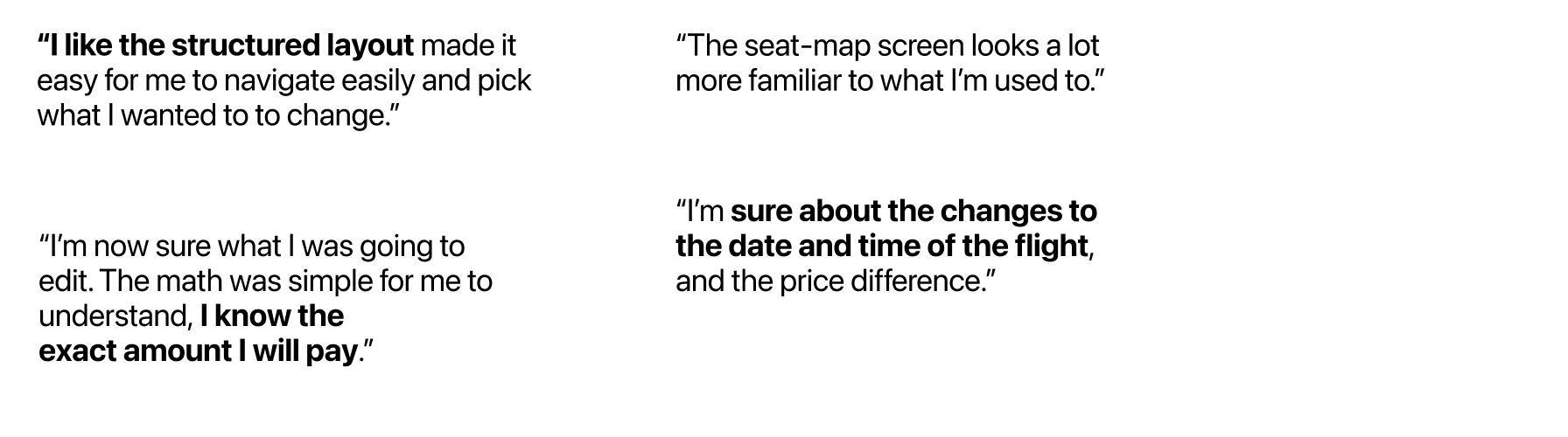
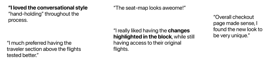
Solution
Customers felt most confident when we over-communicated the actions they could take and what their next steps in the workflow should be. We did this by using messages, a clear hierarchy in the workflow as well as iconography. By doing this, we were able to remove the perceived ‘risk’ customers felt while making such a big decision like changing their flights.


Above are graphics from the Digital Gift Cards project that I led.